"Looks good" & "Feels good" typically wins over facts & figures.
Sad but true. This was a revelation for me a while back. I too was a victim of my own world view and had to learn how to "wear their shoes".
Today I can show facts and figures of ugly website that have 10,000+ visitors and hundreds of leads. In fact, they are far from visually perfect but the websites offer excellent value and are perfectly relevant to visitors.
Numbers don't lie but what does someone have when they don't have facts, figures and results?
All they have left is how they feel. aka - "Judgement"
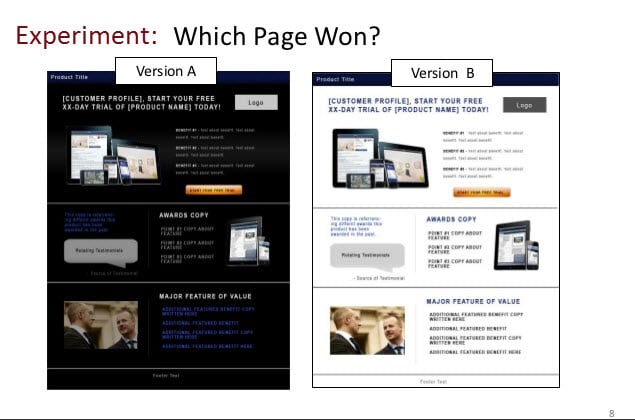
And so, as someone focuses on what a website or email feels like, there is the tempatation to consider black backgrounds. After all, images and videos glow with a black background. This increases the emotional connection and we know people take action based on emotion. A happy user experience is very important.
Can you follow the logic? Black background may add to emotion and inspire people to take action. It feels right and if it feels good, they will like it. Yes?
Unfortunately, most entrepreneurs are much too creative and don't look at anything near the same as their customers do. An entrepreneur should NEVER say: "It looks good to me so it must be great!" In fact, the fact that the entrepreneur feels good about the look should be the first sign that there is a problem around the bend.
The solution: Facts and figures.
You can do your own tests. Switch back and forth between a black background and a white background. If you are truly interested in better results, you will do the test and monitor the numbers. Which has more click-throughs? Which has better conversions?
You can also use a company that does nothing but does test after test. No test is final and you will do your own but MarketingExperiments.com offers a deep well of information far beyond what you have on the shelf.
MarketingExperiments Web clinics usually have Flint McGlaughlin, Managing Director, MECLABS, at the helm. Flint McGlaughlin is a genius.
If you are more interested in how you feel, stop here. You will NOT want to review the following slide show. It will show the results of tests with data. If however you are open minded, looking for new opportunities to improve your results, then dive in.
Here is the video "How Do Website Colors Impact Conversion?"
Were you happy with the tests?
Are you still in love with the background color of your website and/or email?
Do you use data and science to make decisions or are you feely-touchy and don't much care about what visitors think?
There is of course a danger of moving too far the other direction. Numbers do not tell the whole story. No one can be successful by locking themselves in a room and having no contact with people.
What have you decided about the colors of your website? Black background? or White background? (If you still say black, I expect to see you reading books with black background from this day forward.)